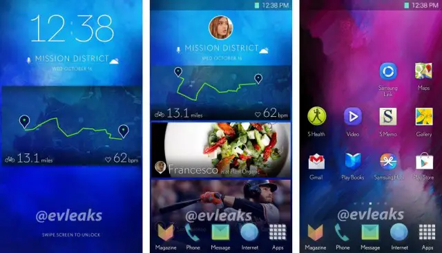
It’s no secret that Samsung’s user experience could use a bit of a face life. Some of you would argue that they need to blow the thing up and start from scratch. While they will likely never go to that extreme, it sounds like Samsung definitely feels like a bit of change is needed. New shots from @evleaks suggest the company is exploring some new user interface tweaks.
The changes aren’t drastic — it still feels like a Samsung phone — but it looks like Sammy is looking to make things a bit flatter. They also seem to like gradient colors, with a good deal of their new icons sporting more than one color blending into each other. It appears Samsung might also be bringing a BlinkFeed-like home-screen pane that offers up various information, stories and more.
The screen unlock mechanism has an updated fitness tracking widget, but there’s nothing else about it that’s too different from what we have now. Samsung has reached a point of familiarity that makes it hard for them to make a huge departure from the norm. Half their success is TouchWiz and all that it brings, believe it or not, so they’ll definitely want to keep going with what’s working.
The leakster isn’t totally confident that Samsung is committed to bringing us these changes in their upcoming smartphones such as the Samsung Galaxy S5, though we can’t imagine they are spending time and resources testing it for nothing. We should get a clearer picture of their intentions soon, as the company is expected to announce the Samsung Galaxy S5 at Mobile World Congress in Barcelona next month.






you could have told me that was the current touchwiz and I wouldn’t have even noticed
Please do something, anything, to improve on the eye sore that is touchwiz.
smart stay is stupid. so is “face life”.
Looks like they ran it through the Themer app.
One site commennters are saying magazine ux is a copy of modern ui from windows phone… I am like oh crap window invented square tiles in ui now
Looks more like Flipboard imo
That is what everyone was saying as well
This is a million times better than the current UI. Still doesn’t look as good as sense but I could deal with this when considering the next Note.
I’ve an S3 myself for 18 months though I have also been using Nova instead of Touching for about a year now. I’ve also use Cyanogenmod 10.2 with Nova for about 5 months now. Not having used Touchwiz all that much (or I may not really remember what it was like) what does everyone think is good about Touchwiz? Where could it still use some improvement? Don’t flip out, I’m just trying to start a helpful discussion by getting opinions from a wide variety of people and points of view.
Touchwiz, not Touching. Apologies for that typo.
I’ve never really cared how Touchwiz looked. What matters to me is how much of a resource hog it is. My S3 constantly lags running TW so I’ve been sticking to variants of CyanogenMod.
I ditched cyanogenmod within days of installing it, I could barely get 2 hours on screen time. Ridiculous.
nothing like buying your phone… 16gb size… right out of the box and having only 7 or 8 GB left to spare… two games and you’re done… lol the only saving grace is the micro-SD
Those icons are looking super colorful. Blue/greens, yellow/oranges.. Reminds me a lot of something….. just can’t put my finger on it.
Umm iOS ?
lol thankkk you for this
OMG..I was thinking the same thing!!! I even put it up there ⬆⬆⬆⬆⬆⬆⬆⬆⬆⬆
I bet the number of ill-functioning redundant apps (like Svoice) increases.
I replaced all the Samsung app shortcuts on my S4 the first day I got it, so I never really noticed how intrusive Samsung is with their factory image.
Recently a (non-techie) coworker showed me her Note 3, and I couldn’t believe how completely Samsung’s pointless shortcuts and oversized, ugly widgets had taken over the real estate of all of her home screens. Really shocking.
I seriously feel bad for the non-hobbyists who stick with the default launcher and home screens – they spend their first weeks learning to work around a hobbled phone and assume that’s just how Android is.
I like the touchwiz on my note 2,but this is not cool. Looks themed
Those screen shots….remind me of iOS 7… Nnnooooooooooo!!!!!!
You’re an idiot.
I don’t see ios but some of you dudes just had to say it for the sake of saying it
They need to ditch that physical button and capacitive buttons for on-screen buttons
No they don’t. I use that button to wake up my phone. Using the power button just feels awkward now.
I agree, but they can do on screen buttons and use the “double tap to wake up” feature that LG has… I think that’d be great.
Looks like I’ll be keeping Nova Launcher running for the foreseeable future. :)
Even with a Nexus 5 I ended up reinstalling Nova. It’s just too good.
Yeah, it really is. And I’ve fallen in love with my icon pack, and since updating to JB my phone is much faster, so Nova has been working like a dream.
@coryskelton:disqus What icon pack are you using? I’m on a hunt for a good one!
In the Play store its under Glaskart Go Nova Apex Theme.
I like it better than the current appearance of TouchWiz or “NatureUI” or whatever the hell they’re calling it now. It has a cleaner more sophisticated look compared to the bright bulky cartoony appearance on the S4’s UI.
A major UI overhaul needed! What Samsung is testing right now, doesn’t look all that great. All those colors look so gaudy and unattractive, and childish! Look at the colors used for the phone, messages, browser icons. Even a kid could do something better than that! Also, look at the new font! Seriously? Grow up Samsung! Hire better UI designers!
I think it looks a little too stock android-ish… I like it tho.
Yeah definitely better, well almost anything is better than Touchwiz.
I don’t know why people hate Touchwizz so much… yes, it does have a million features that are useless but it also has another million that are very useful indeed… all you need to do is turning the bad ones off and enjoy the good ones… no biggie.
I was referring to its aesthetic design more than anything.
I’m not against the TouchWiz features. They are actually better than the features on any other phones. I am just bored of the same old UI. I think it needs a fresh new look, a fresh new UI.
About time for a make up uh? Out of boy Sammy!
Touch wiz is not all that bad. Just like every other UI it takes some getting used to. I have dealt with all UI across android and they all have their positives and negatives. I have my device running exactly how I like it. A clean home screen with nothing more than Dolphin, poweramp, myfavs folder, handscent and phone. To my left a full calendar and to the right a Google search bar, shazam and flashlight button. Hold down the home button and instantly close all running apps. If you take the time to learn your devices you’ll cime to live whatever UI your using. Theres always a way but are you willing to take the time out or are you a follower and just buy because “its in”
For those complaining about the SIII battery try closing running apps often and turn off 4G when not using the internet (if you have 4G) this helped me with battery life alot. On the note III I follow this same process (habit now) and get a full day and a half of battery life.
Try upgrading to a newer phone. Galaxy S5 is around the corner for gods sake.
i use the Google home launcher on my S3 and love the simplicity and clean look of it. This looks like Samsung may be going more of a vanilla android route with the UI. I think that’s great!
I hope the next TouchWiz will look as this. But they also need to better optimize their UI. Can’t wait to see the galaxy s5
touchwiz needs an overhaul but this is fugly. i hope this leak isnt true.