
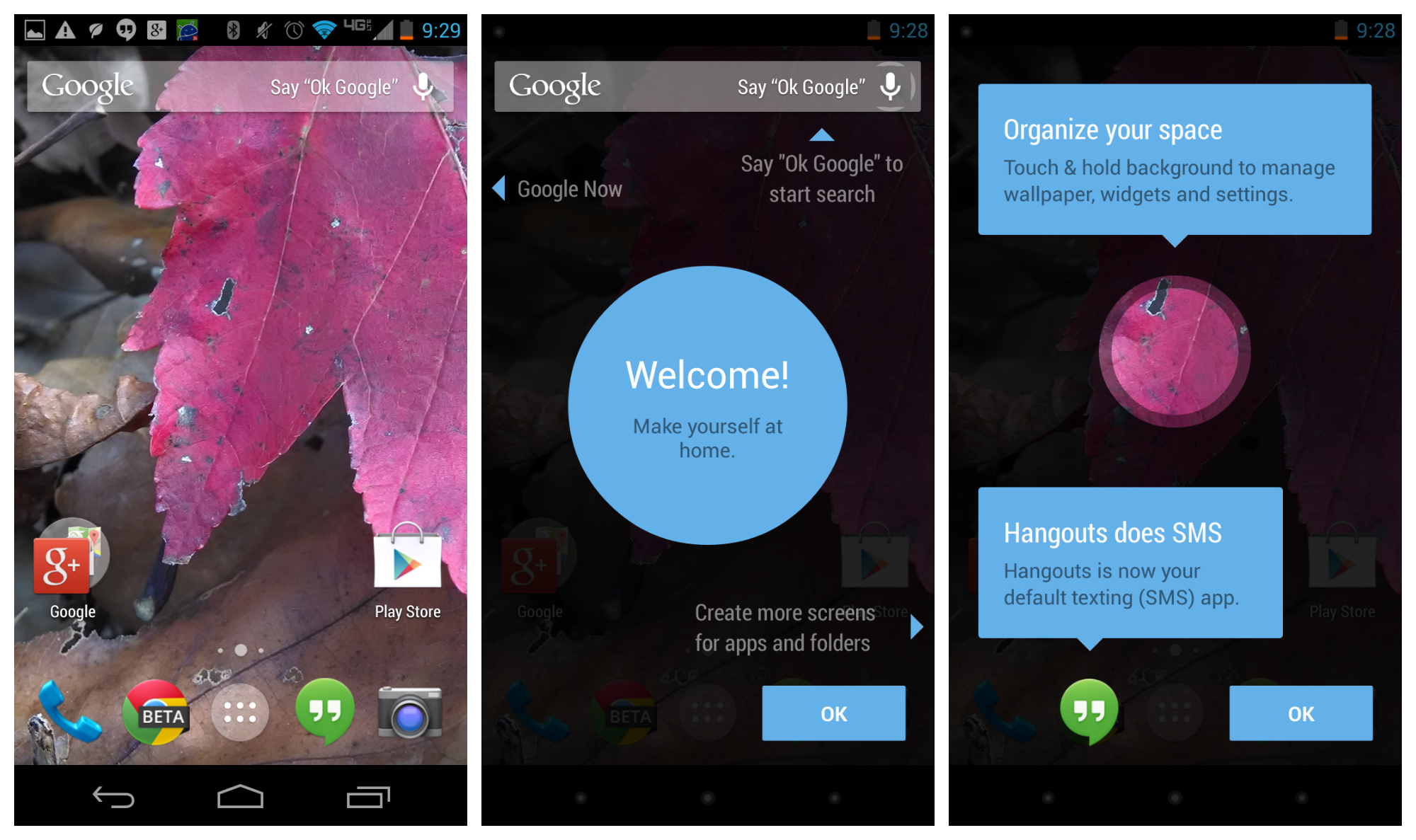
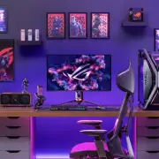
While Google’s basic home-screen has traditionally consisted of 3-5 panels, the new Google Experience launcher — the one that includes a Google Now pane on the far left — allows you to add as many as you want, as well as rearrange them however you want. Some folks were a bit confused by how to do it, as this option in custom launchers is typically found within a daunting settings menu.
Thankfully, Google made it intuitive and easy to add and rearrange panels using nothing but gestures. You can find out all the deets in the video above, but if for whatever reason you can’t watch it then be sure to look below for instructions on the various actions available to you.
To add new panels
This is going to be one of the more confusing ones, as this is something typically done in a settings menu for traditional custom launchers. If you want to add a new home-screen panel, simply follow these easy steps:
- Open the app drawer
- Find the icon of an app you want to place. Hold down on that app until the interface for placing it pops up.
- Instead of dropping the icon on the available home-screen panels, move your finger all the way to the right edge of the display. Keep it there until you reach the end of the list. A new, empty panel should show up. Drop the icon there.
And there you have it! You can add as many panels as you’d like (we’ve been able to add as many as 15 so far!), so go nuts with whatever you want to do.
To remove panels
To remove a panel, simply remove all icons and widgets from said panel.
To add widgets
Hold down on an empty area of any home-screen panel. At the bottom middle, you should see an icon for widgets — press it. Find the widget you want, long-press on it, then drag it to any home-screen panel that has space (or add a new home-screen panel as detailed above).
To rearrange panels
To rearrange panels, hold down on the background of the launcher. From here, simply long-press one of the panels and drag it to whichever position you want. Remember that the far-left panel will always be the default “Home” panel (so if you’re on panel 4, pressing the “Home” button will take you back to that panel). Unfortunately, there is no way to delete an entire home-screen panel without the method listed above.
Tada!
And there you have it. Some of this stuff may be trivial to some of you, but considering this is the first time Google has given us this level of customization for the default home-screen we wouldn’t be surprised to learn that many others are confused.
Google’s new launcher doesn’t quite stack up to the competition which often provides much more flexible and useful options, but this isn’t too bad for their first shot. There’s still some work to be done yet, but with future updates this could be one very sweet launcher. Be sure to watch the video above if you are more of a visual learner than anything else.


hate to say it, but they basically copied iOS’ method of adding/removing screens…the app drawer/widgets/live wallpapers is really the only thing that separates them now(as far as the stock launcher goes).
The drawer, widgets, and live wallpaper has always been what has set it apart from iOS. The method to adding/removing screens doesn’t really make them all that similar
never said the launchers were similar, just said they are using a similar method to iOS when it comes to adding/removing homescreens…people attack iOS whenever they copy android(notification shade etc), but no one wants to admit android copied iOS on this?
but the part about the drawer/widgets/live wallpapers being the only thing that separates it from iOS makes it seem like you are saying that. I was just saying that the 3 things mentioned above are the major things that separate iOS launcher from android, not adding/removing screens
wasn’t trying to minimize those features, i see how it reads that way though. I agree that they are more important to the android experience than adding/removing screens.
Kind of a stretch to say they copied this from iOS when iOS has no widgets nor an app drawer to drag from.
that’s nitpicking, the general idea comes from iOS, adding/removing home screens is done the same way on iOS, just the icons come from a different source
Yeah, this is 100% copied from iOS. Those saying it isn’t are just too proud to admit it. I hate the fact that you can’t have a blank homescreen, or that you can’t use two fingers and pinch out to see a view of all panels. That’s how HTC and Samsung do it, you pinch out and can see all your screens, and you can add and delete them. That’s the best way to do it.
Yeah, that one is blatantly copied from iOS, together with Google Now on the left (pre-iOS7 there was a search screen to the left from main screen). I’m not very happy with it, but at least we can add/remove screens on the stock launcher, which wasn’t possible before.
I agree with you. They copied that.
Sad they decided to copy something so lame and not nice.
This new home screen effectively removed the option for a blank home screen (to show off your wallpaper). If you delete anything from your home screen (or any other screen), it deletes that screen and replaces it with the one to the right. You HAVE to have to something on each screen. Makes me sad.
I’ll probably get hate for this, but honestly, I’ll be installing Apex or Nova shortly after I root (which will be in a few hours). I’m not a fan of Google now being so integrated with my homescreen.
Nah, I am with you. My launcher on my N4 was apex. I installed it on the N5 right away. Doesn’t matter though, I decided to return it.
I sorted that issue out by using Simple Text widgets. I go to the add widgets option, select simple text (I use 2×2) hold and drag to a new home screen and use a blank square png file as the icon, I chose an action, you can select none if you wish but I set it to launch the play store, hit ok and now have a blank home screen to show off the wallpaper with a hidden icon.
*Wipes away tear* I want this on ICS. *Sniffle*
I have it on my gnex right now. You should use the internet to search for the 3 things you need to install.
I got Parse errors on Velvet and Google Search. Play Services installed fine
R.I.P
Apple is destroyin’ everyone.
No remorse no recourse hipstersss is back with titanic force scamsung is the new titanic of COURSE Apple will never change COURSE eric smut was a TROJAN HORSE android is full of TROJAN viruses and destructive FORCE
Here comes the CHORus
B0tG0@ts are so mad (So dang mad)
Its quite sad (So dang sad)
Hipstersss will always be rad (So dang rad)
Phatman is a horrible dad (Its really sad)
x2
idiot
Lol @ here comes the chorus… You win the internetz today
You’re fucking moron. And there I was, answering your troll mambo jumbo in the other post.
That is GREAT that Google finally added this functionality!
The fact that you had to write this article because “some folks were confused” means that your assertion that “Google made it intuitive” is false.
That you have to add a widget or app to add a page is definitely counter-intuitive. Add a page first, then put stuff on it. That’s intuitive. Sorry, but I can’t join the Google Experience Lovefest just yet. I’m going to stick with Nova for a while.
I have loved my Android phone exponentially more since installing Nova.
And agreed that it’s more “intuitive” to add a page first, I can’t watch the video yet so maybe it’s more simple than they make it sound, but it sounds like nothing I’d have figured out by accident.
Why four columns and five rows. This is my only gripe with the stock launcher. Need 5×6. Looks much better anyway
Anyone notice how much they miss the curved screen edges on the Nexus 4 when swiping in from the side? :'(
I’m so glad u mentioned this… I hate the look of the larger icons and the 4×5 grid, keeping it in line with JellyBean would make it look cleaner
Single biggest complaint of mine so far the Jitterbug-inspired app icon sizes.
Agree with all of you. I also need a 5×6 grid.
This big icons are excessive for a 5” screen.
It’d be nice if you could delete a homepage like you delete photos/movies in Gallery.
After you long press to pull up the available screens, left/right rearranges, while flinging up/down deletes, with UNDO if you accidentally delete.
Missed opportunity.
So obvious, that I can’t understand why Google didn’t saw it too.
Can’t wait for my homescreen Google Now page! No more dumb loading times.
I didn’t considered that, but it’s true. Google now is now (sorry) very fast to launch (since it’s always running)…
I don’t see this dough being very memory friendly. I find, for example, feedly being thrown out of cache each time I view an article in Chrome and when going back to feedly I loose my current reading status and get a new home set of articles…
Not sure if it’s search/launcher, feedly, chrome or a combinations… But with 1 GB memory in my HTC One X I would expect room to go back without reloading.
But again I don’t have full kitkat configuration. Only 4.3 with kitkat apps added.
Try out Greader. It uses Feedly for pulling the feeds and you’re able to a. Read the article within gReader b. Open it within in case it didn’t download or c. Open in separate browser.
It works great and it’s a clean look like the old Google product. You’re even able to comment without opening the browser. I’ve tried different readers but I keep being back to this one.
Not impressed with the nexus 5 so far at all. Specially battery life
I ain’t mad at cha, Google and LG… I just got four hours of screen time before the battery gave it up. I’m okay with that.
It’s a big screen and a lot of pixels without a huge battery. I’m guessing it’s similar to the crap battery life I had with my s4. I got rid of that thing so fast! I’m on vzw so I went with a moto x last month and its been the best phone I’ve ever owned
Have a friend with that phone and its actually a pretty damn good phone. Did you customize yours?
I have to agree, the speaker is not that great either :(
I seem to notice they always skimp on that on the nexus devices.. Specially the galaxy nexus. Worst speaker ever!
“vi can be considered very intuitive. Intuition can be learned” — Unnamed College Operating Systems Professor (1993)
People often confuse intuitive with easy of use. And I’m sorry phandroid folks, but some of the new Search/Launcher functions, while easy enough (arguably some of them) when you learn how they work, are not at all intuitive.
Some folks were a bit confused not because they are used to other things, but because this functions are not intuitive as you claim them to be.
Since I have comments to each google election for this functions let me go one by one:
To add new panels
The intuitive thing to add a new panel would had been to have a + button in the panels view when you long press the desktop or a grayed panel (with a + sign) to the right of the last one (like they did for the lock screen widgets).
This would have been more intuitive, by definition, something that comes natural with out having to learn how to do it.
To remove panels
This is a case where your affirmation that “Google made it intuitive and easy” is not even half true. This not only isn’t intuitive but also, how can you call easy to delete or relocate up to 16 icons to remove a panel?
I would consider easier having the option to swipe the panel up (like with photos in the gallery), preferably with the same undo option when editing (long press on desktop).
To add widgets
Here I don’t have a complain, since I never liked the widgets as a part of the apps menu. I do like this one.
To rearrange panels
This one I guess I could have figured out eventually. But I didn’t try yet. Neverdeless, I some times “loose grip” (I don’t know how to describe it better) on a panel if moving it directly to the side. I get what I want if I hold the panel and move a little up or down before moving it to the side I want it.
To end my long comment (sorry folks) I have to say that your attitude towards google is getting very like apple-fanboys. All that google does is perfect. And in this cases I can’t agree with you.
Some of this launcher functions don’t help create an homogeneous Android experience and instead of the obvious (intuitive) options they went some other (at times weird) way, that force us to learn things.
The mere fact that you wrote this article proves my point.
The basing telling me how stupid I am can start…
I tried it out for a day, but imo Nova is superior in every way.
I really don’t want the Google search bar on the homescreen. I also want to be able to scroll up and down my app drawer and I like the line between the dock and the main screen. And then there are gestures to launch apps…
I do not like that you can not have a blank pannel. I like nothing on my home pannel.
Actually, you could have a blank panel……… eliminate every icon from your homescreen… all your homescreens……. voila.. a blank panel.
Yes but you will only have one blank panel. I like the home to be blank then the panel to the right to have my widgets.
do this. put at least 1 app on your home, and put the widgets on your second screen…….. then remove the 1 app on your home. did that work?
No it moves the right panel to the home screen.
Not sure if it has been asked but can you have more than 1 dock with kit kat? And if so, can you have folders in them?