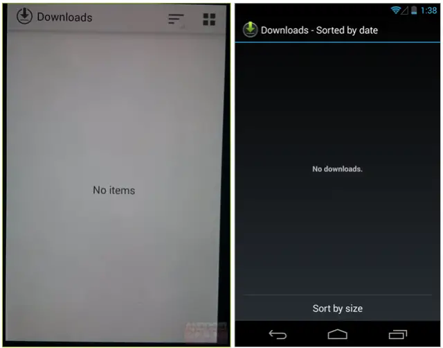
Normally, when new Android versions are released to the world, Android fans such as ourselves don’t head to the Downloads app to look for any new goodies. However, when the Downloads app is about to undergo a complete graphical redesign, we pay attention. As we continue towards the next batch of Nexus devices and the inevitable Android 4.4 KitKat release, the pace for leaks has quickened. Let’s take a look at what we have this time around.
- Pictured above, you can see the side by side differences between the leaked UI and the current Jelly Bean UI.
- New Holo Light theme instead of Holo Dark. A white, light theme matches other core Google apps and seems to fit quite nicely with other leaks depicting a whiter Android UI.
- The Downloads icon is now much cleaner and flatter.
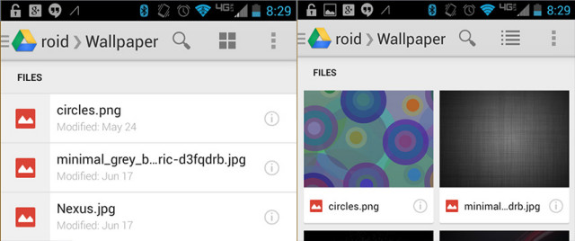
- The action bar also includes two new icons. The icon with the three lines most likely contains sorting options for sorting by file size or by date. The four square dots icon is most likely for changing the view from displaying files in a list to cards, or tile view, similar to how Google Drive currently looks and functions as shown below.
Do you like the new Holo Light theme with flatter icons that seem to be the theme with Android 4.4? Let us know in the comments.
Source: Android Police





I liked the black because I felt like it used less battery.
Only in AMOLED. Even still, I keep my brightness on max with my HTC One running Google Play Edition 4.3 and battery life is stellar. I’m sure it’ll only be better on the Nexus 4 :)
I love my HTC One’s screen! It looks so good with the blue and black status bar. I’m going to be sad if they change the icon colors to white in 4.4.
You mean Nexus 5? :p
On AMOLED Black is the battery saver because each black is the pixel turned Off, because every pixel is the light source of it’s own. On LCD, White is the battery saver cause behind the screen we have a white backlight and the screen has no opacity… for It to turn black, the screens uses battery from making the screen opaque black so you can’t see the white from the backlight.
It doesn’t really matter either way to me. I think I prefer dark ui’s because it provides less eyestrain in dim settings.
Yeah, sometimes I check my phone at night and my eyeballs jump into the back of my skull. Lol. Hurts :/
Especially if you were in a lit room and then pull it out in a dark room before it adjusts. I speak from experience.
For me, I keep my brightness on max. ALWAYS.
I know, I know… I’m pretty reckless like that. A regular Android bad boy.
Ladies? O_o
*crickets*
how do you have any battery life? i keep my brightness on zero or on auto if its sunny always.
*looks around* slow night huh lol
i know some youtube reviewers who say they put their android devices on 80% Brightness and get all day battery, how is that even possible? when in Doors I put it on 40% which is plenty bright, especially at night. When I am out though I do have it on 60 – 80% sometimes even 90% but 100%?? Thats just crazy.
That’s what I experience every night when I open a Google’s app. Plus my kids wake up if I do it their room. Simple click on Gmail turns you into a damn Prometheus.
This light theme is a step back for me, I really hope I’ll be able to choose. And make the Gmail black too!
You should use screen filter it helps loads
Attn: Chris Chavez, did I or did I not predict this? Actually, I recall betting my left nut that the next version of Android would reflect Google Now.
Did you? I’ve been hoping for a long time Google would move to a lighter (read: whiter) Holo card-like UI.
I know a lot of people actually prefer the current dark, Tron UI, so it’d be nice if there was a dark or light theme chooser. Although, probably unlikely. :/
You know… I’m down with the new cardified (woot new word) UI that’s been slowly coming to Google apps for a while. For it to creep into Android’s core is 100% alright with me. #HOLOYOLOCARDS
#Cardallthethings
i love the dark but I agree I see it moving more toward a google now type look, which is really their trademark, and after doing a double take on the screenshot above I am starting to think I will like it more than the Dark Holo.
Congrats on keeping your left nut.
lets be realistic for a moment and say he lost his left nut in a bet who the hell will come and collect it anyways lmao!
A small change, and from an app nobody really ever uses. Still nice.
Anyone notice a lack of software nav buttons in the leaked screenshot? Strange.
I noticed that too. I assumed that it’s a photo taken and not an actual screenshot since the image is skewed to the side a bit. Maybe the leaker tried to show a little of the phone as possible or just missed it?
No notification bar either so yeah its been taken with a camera and not a screenshot from the device itself.
No one uses Google Drive??? You have to be Kidding Google Drive is extremely useful I use it all the time, if you actually start to use Google’s Ecosystem you start to realize how far ahead of everyone else it is. Also the UI looks 10x better than stupid Dropbox’s ugly interface
so its a photo, but has been cropped (not just a miss) to not show top/bottom. hmmm…
Am I the only one that seems to prefer holo dark? I’m all for clean but you can be clean and sleek in black.
Nope, you’re not.. Dark all the way for me too. I’m hopeful we’ll be given the choice between the two.
Yeah, I wish it was a system setting.
same, i honestly like the Nexus UI as is, although after taking a second look it does seem more polished, so idk I think it’s too early to make judgements based on 1 or 2 screenshots.
I really hope they give us a choice on this. Dark is the way to go imo. I personally think that Google should offer dark and light themes for all of their apps. This is especially important on AMOLED screens where blacks save battery due to not utilizing pixels
If the developer takes consideration to that fact, which many don’t :-(
Actually a lot of them do. Google is a notable exception. If they did it then I think the majority of holo apps would follow suit
I absolutely detest light themes. Not only is it less aesthetically appealing, but it’s harder on the eyes and the battery. Dark themes should definitely be the norm.
Light colors are EASIER on battery life with LCD screens (not with AMOLED though).
Only marginally better on LCD – a few percent – but otherwise, yeah, it’s far bigger (and worse) difference on AMOLED.
Anybody else notice the Verizon like LTE symbol? Does that mean evil RED is getting a nexus as well?
That’s my screenshot showing “how Google Drive currently looks and functions”.
Thanks. Was wondering why the lack of cohesion with white and blue status bar icons. No disrespect to your preferences.
no but sprint is! :)
I love the design language introduced with Google Now and further developed in the music, books, and movie apps. Even gmail is a lot cleaner now. I look forward to seeing Google further enhance their design language across the system.
I agree. I like how Google apps are starting to look like they are made by the same company that has the same design theme.
would be nice if there was a dark holo for when your in a darker setting and a lighter for a brighter setting kinda like the GPS
My god there had better be an option, otherwise my Gnex will have to last until the Nexus 6 or beyond… :(
Much prefer darker Android look.
White is so better and it does not affect battery life.
Yes, it does, for SAMOLED.
That’s true but then everyone with a samoled phone is saying the sane thing about black themes lol
There goes my battery life. What is Google thinking?
My first thought as well.
i dont know, maybe only for amoled devices. My Evo LTE had a light theme on sense, and it didnt have any less battery than my nexus 4.
Light themes means more battery life with LCD screens. Only LED displays consume more to produce white.
Why do you think iOS gets lighter and lighter ?
I have a S3 so it will definitely hurt my battery life.
that’s if you s3 even gets this bad boy.
i love change, my only issue with stock (besides camera) is the menus always look dull.
Dull in what aspect though?
i mean its fine, nothing is wrong with it, its simple and plain. But I wouldnt mind a little pizaz though. You know me. Always with the flair.
Sounds like you need a Bedazzler? jk… :-p
lol maybe so. Its fine but i wouldnt be mad if it became a little more than just white text on a black background.
I hope there is an option to change between Light Holo and Dark Holo
All I read in the title was Android 4.4 Kit Kat Leaks DOWNLOAD
>_<
Gonna take a cold shower now
That is exactly what I read. The title isn’t misleading, per se, but it is written in a way that is slightly confusing.
Well it was written by Derek Ross
It’s about time they make their interface nice looking. They hire a nice design team with all the money they’re making from forcing website owners to use AdWords after their Hummingbird algo update! $_$
Google can’t do more than change some colors and icons. Most OEMs will never update their phones.
I hear you, but its going to have to happen at some point.
Ugly.
Holo Light’s not bad – especially in daylight – but on AMOLED displays I still want the option to switch to battery-saving holo dark, else theme workarounds are needed.
Does a white background usually work better than a black background in direct sunlight? That was the initial question in my mind when I saw the images posted above. I saw your comment and thought I’d reply, as you likely have more experience than I do with using smartphones while under sunlight. Thanks.
White does seem easier on the eyes in direct sunlight, yeah. The only two apps I’ve used in sunlight lately are both holo-light now: Maps and Music.
Sounds like the KitKat announcement is going to be a pretty boring reveal – when it comes we’ll know pretty much everything.
I don’t expect major UI changes from KitKat. After all, it’s only a incremental versiom, so we’ll probably have to wait until Android 5.0 to see major UI overhauls. That said, I am happy with the current UI in Android and can’t imagine why I would want a major overhaul at the moment.
From what I’m gathering, KitKat is mainly for under-the-hood changes and for Google to update services outside of the main OS so that older Android versions can receive software updates.
New holo design is awesome!
the white looks all stale and ghostly lol
It looks great to me. Nice and modern!
The white looks bad. Hopefully they give us the option to change this.
it sjust seems so boring, it might make the OS run faster and smoother which is welcomed but dam, its so plaaah, dont even know what word to use
At first glance I was like “Gross!!” but after looking closer it looks much more professional, I think the human nature of hating change like most do is just nagging us, plus I am sure there will be roms for people that want the Dark Holo UI.
Sucks for people with AMOLED screens… Sent from my awesome HTC One.
Ok, so apply a different theme.
That might be easier said than done. Sometimes there isn’t an option to change the theme without some trickery. Hangouts for example, doesn’t have a dark theme.
It is starting to look like iOS, good for Android!
Not really. iOS looks horrible.
Really? Hmmm… Maybe that’s because iOS is starting to look like Android? Pull down quick settings & a default theme eerily similar to Androids.
Much better. I’m really done with the dark techy-look of Android. Really love the design of all the major Google apps such as Now (the design, not what it does, of course), Maps, and the Play Store. (The design again, not the boneheaded way it treats the top left navigation to not back up to the previous screen (say, existing search results) but go all the way to the initial screen. Combined with the ‘never the same function’ of the actual back button, this remains a mess.
I’d bet there’s a selection between dark and light themes; like Google maps perhaps where it’s dark theme at night but light theme during day
I hope so. I don’t care much about cosmetics, but I kinda think all that white would hurt my eyes after awhile.
Yes. I would use the light theme during the day, then the dark theme during the night.
Ooo!! I’m imagining some mod that changes the themes during certain times of the day.
What I really want: List views with no icons at all. I’m tired of having to scroll to see anything at all. Wasted real estate on a screen as small as my S4 isn’t okay.
G+ is really terrible thanks to this, and it looks like they’re going to expand it. :-(
The stock album app needs an overhaul. Shouldn’t take a few seconds after first opening for my albums to finally show. For now I have to use another app, hoping that won’t be the case for much longer.
You’re complaining how long it takes to open the app!? My gosh!! What about after the app opens!? It’s SO hideous. Like there is NO organization. It’s just squares of pictures that make no sense to me.
Someone pointed me to using QuickPic. So I just use that when using a stock ROM.
I agree it is ugly and completely disorganized. But there is no excuse for how long it takes for albums to load… I would expect this on older phones/OS’s but not the most recent of both. I’d assume if they’re going white in their default apps that the look of the gallery will change accordingly.
I use QuickPic for my pictures, it’s a huge improvement. Only downside is if you want to edit pictures you either need to go back to the gallery app or have ANOTHER app for editing. But for general album app functionality it is fantastic.
That is true with the editing. I have PicSay Pro. I just use that for all my editing needs.
The only thing I use the stock Gallery for is viewing photos when you click on a link or something to view the photo. I’ve gotten used to the location of the share button.
It’s hidden in my app drawer. =.3
I loved. I have some Androids with me and the most beautiful skin is my galaxy Note 8, because it is the only Holo white, while my asus and Sonys are holo dark.
Anyway, its much better to let the owner to decide if he want dark or white.