
Straight out of left field, Google is dropping an all new YouTube version 5.0 into the Play Store. It’s been awhile since we last saw an update to the official YouTube app and the latest update (rolling out now), brings, not only a new card-like UI and improved navigation menu, but enhanced features like PIP.
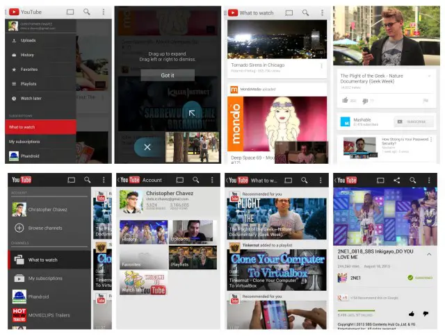
(New YouTube 5.0 top, old YouTube bottom)
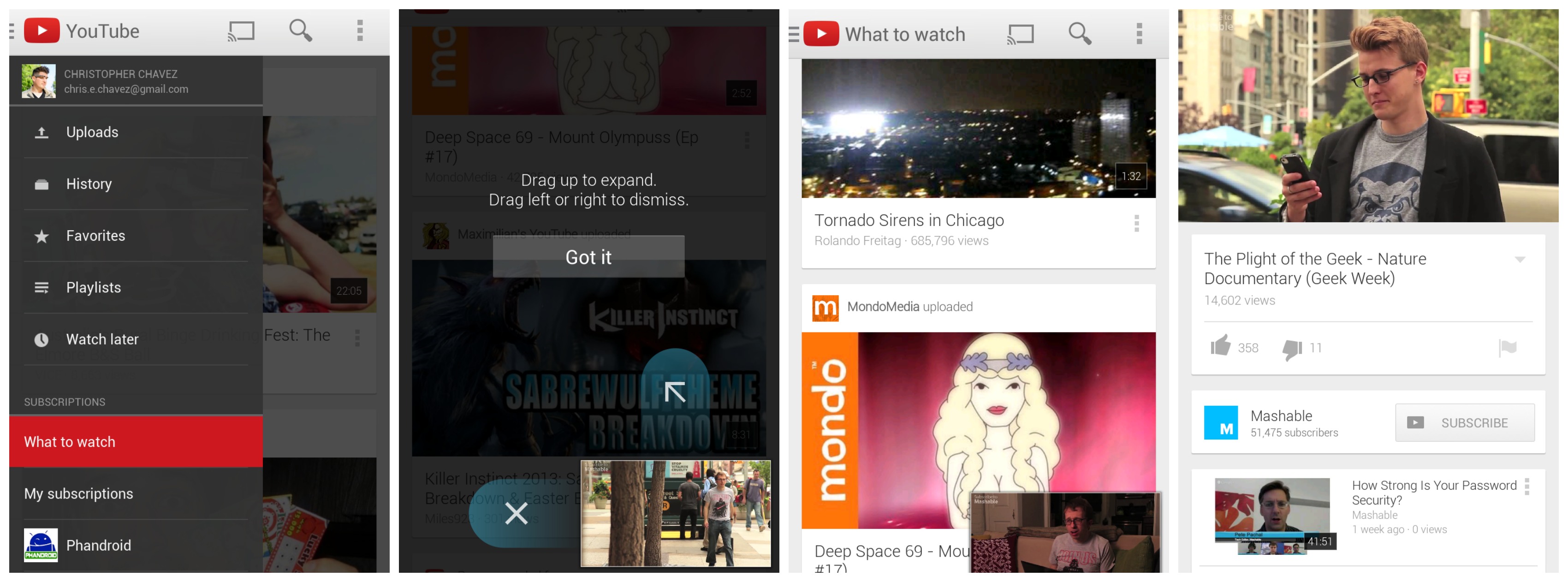
First up is the navigation menu which is accessible by swiping from the left edge of your display. The menu is now populated with quick access to uploads, history, favorites, and playlists (without having to select your profile first). Below those, you’ll find the familiar subscribed YouTube channels.
Easily the biggest new feature is the addition of the picture-in-picture viewing option for any video currently being viewed within the app. Simply swipe a video down (or click a check mark in the upper left corner) to minimize said video into the corner and continue browsing YouTube. The minimized video can also be swiped to the left to quickly close it. While we would have liked to have seen this option system-wide (outside of the YouTube app), at least it’s a start.
Of course, the usual bug fixes and system enhancements also apply and like always, this update is being pushed out in stages. So, don’t freak out if you can’t update just yet — it’ll arrive soon enough. Can’t. Stop. Minimizing.




awesome about time.looks like iphone users already had something similar??
Lol YouTube on iPhone looks almost the same as on Android cept its a lot cleaner and easier to navigate on Android
Not at all sir.
about time but i think ios users already had something similar
joto stop taking my stuff off
lol kpop
Chris Chavez, I predicted that android 5.0 KLP will follow Google now design. Further proving my theory is Google updating core apps to reflect this design. Bet.
I agree. I think Holo will be a lot brighter, whiter, and more card-like. Everything is already heading that way. KLP should be an interesting update (I think a lot of people might find themselves turned-off at the new UI direction).
I think it looks great, personally. More cards UI!
Cards as in webOS cards or…?
No I mean Google’s cards, like the ones they have implemented in Currents, G+ etc.
Hey Google, how about giving us the ability to watch (listen to) videos with the screen turned off? PLEASE!?!?! Apparently, they’ve never heard of ASMR :P
wished the official version had that as well, you can get a version that does that and more at XDA
I remember when we were able to do this. I used to do it when I had my Sensation
2ne1!! ^_^
CL is my favorite. O_o
cl is pretty awesome, but my favorite is bom. i’m a little bit annoyed though that cl has been getting a lot of focus lately at the expense of the other members.
You wanna be Asian.
Wow Google is really into this cards-style UI. I wonder how long it will stick around. It’s not bad, but I’d prefer something better, but obviously this look will be around a few years at least. Meh.
On a side note I was watching YouTube on my phone as my boyfriend was on his PS3 and suddenly it was showing me how to throw videos to the TV…that is one very cool feature, feel stupid for just discovering it though.
Well, it’s hard to impress everyone! Maybe you should tell Google the better idea you have in mind. :)
She can still have an opinion, chuckles.
I like the card style. It has a minimal-like design, yet it doesn’t give minimal information like actual minimal designed things.
Also the different colors give it more flavor then grays. Though I don’t mind gray, but only for minimal stuff.
finally picture in picture ….another sick feature !!
Hmmm.
So now I can see fewer videos on the screen at the same time when in a list (ie What to watch), which means more scrolling.
Comments still aren’t threaded properly, nor are there top comments still.
The small video screen might be useful if it would work anywhere outside of YouTube.
It now takes multiple actions to stop a video entirely.
Tablet mode on 7″ feels too squished.
Can’t stop minimising indeed.
No rotate to full screen either.
This UI sucks. It makes things harder.
Is there a trick to getting the update? My S3 won’t see it.
APKs available here. As always, YMMV.:
http://www.androidpolice.com/2013/08/19/download-youtube-for-android-v5-0-21/
.
Is there a way to get rid of ads? For YouTube in iOS, Cydia has a tweak to accomplish this. Any way in Android?
https://adblockplus.org/en/android-install
Download for youtube update is now available, to download it visit
windroidblog.blogspot
THANK THE HEAVENS!! Oh my gosh!! I can easily get to my history. I HATE having to click through so much stuff. Anything to make my life simpler. LoL!!
Now if I can only get the “Play Next” option back in Google Music, I think I’ll be content for a while. LoL!!
I’m impressed in the overall changes to this application, the minimizing feature runs smooth
love the changes but am i the only one whos screen starts flckering out when a video is minimized? if anyone knows a work around help a bro out. :-)