
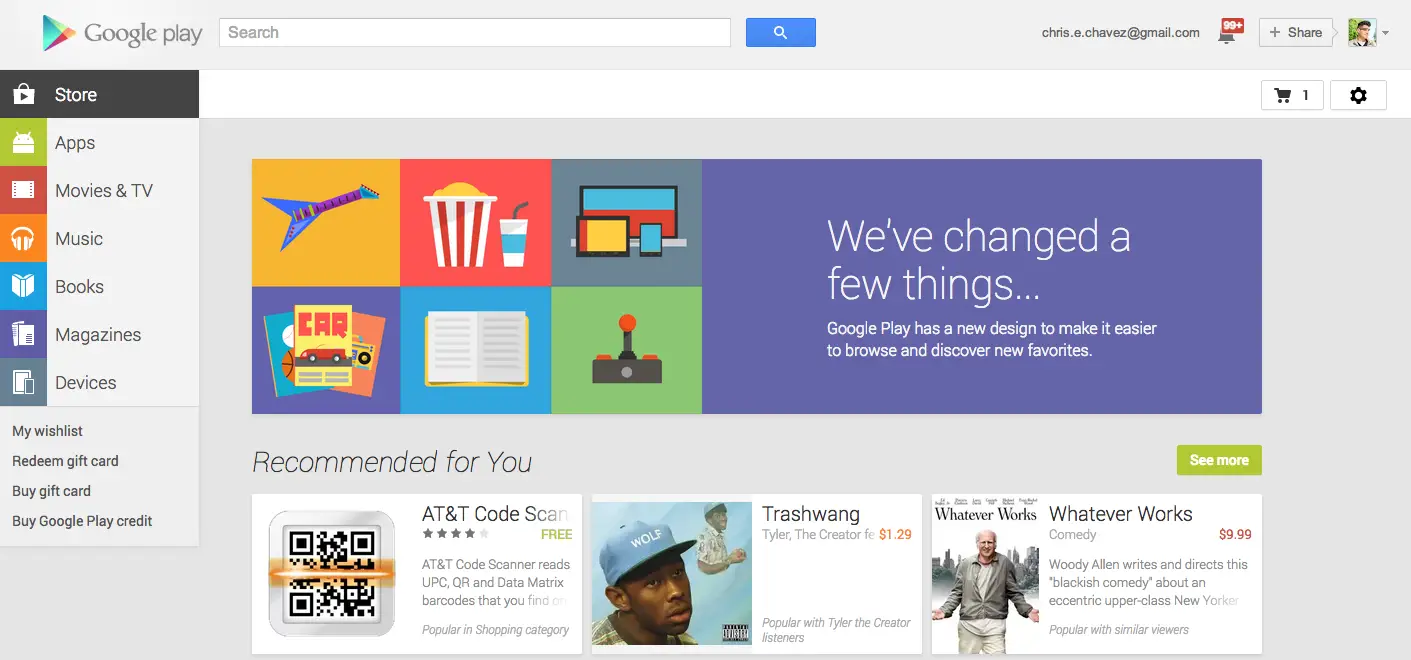

Moments ago, Google officially flipped the switch on their completely redesigned interface for the web version of the Google Play Store and it looks… glorious.
Besides a look more in-tune with the Android application, the new Google Play interface FINALLY makes user Wishlists accessible via the web, making it easier than ever to save interesting apps for later downloading. Lots of new stuff here, folks. Make sure to check it out for yourself and let us know what you think.


I can see they’re taking that Google Now look to the extreme. The colors make me feel… happy for some odd reason. It’s a very playful design. Hmm…
It’s almost childlike.
Simple, minimal, bright colors everywhere. Yeah, it’s like the kiddie-store. Lol
You should visit one of their offices. It looks like that inside 0.o
I love it! Ever since they updated their Books page I’ve seen about 3 e-mails telling them their TV and movies section sucked ass…the only criticism I have as of yet, is for Books you can delete them from your library, but not free TV episodes you’ve “purchased”…I was hoping they’d add that with this update but other than that I love it.
Not pleased with the search result display on my 1024 wide laptop screen. Icons are cut off at the RHS. Names are limited to about 12 characters before the text fade kicks in. The promo text/descriptions are completely missing- so users have to judge an app mostly on an (incomplete) icon.
a 12 year old kid could have done a better job with the UI…it is absolutely unbelievable how terrible this update is. Mega epic fail.
I love it, but I keep getting “An unexpected error has occurred”. Looks like they need a little more time to work the bugs out, or, less likely, a flood of people are checking out the new design and google can’t handle the load. (I was having trouble with play.google.com/books earlier as well)
Looks nice but did they remove the useful review options like newest first, helpfulness and my device only? Or i’m just blind?
They always take away the little things that make a HUGE difference. Reminds me on how they took away “Play Next” on Google Music. So now if I want a song to play next I have to manually drag it under the currently playing song. I used to be able to operate Google Music with one hand. =.(
But let me not get off topic. LoL!!
PLAY NEXT was soooooo useful that I still reflexively look for it in the menu, only to disapointed all over again. :(
Colorful yes. But this whole Now theme with cards, etc., reminds me of how South Park was originally made. Cutting out shapes from colored construction paper. Each shape is a single color, no shading, or texture. Maybe it takes less lines of code to render them? What’s the advantage of HD screens to display these kind of images? imho.
It is quicker to render squares and flat colours take up far less space and while I much prefer the look I’ve also been wondering why it’s taken until now, when we have beastly hardware, that companies are finally getting rid of the chrome. Makes you wonder if computers would have been noticeably faster in the old days without all the gradients and whatnot.
But now, I can’t see which apps are actually installed on my device. First purchased apps, now all my installed apps? Come on Google!
Yeah, what happened to the ability to see which apps are installed per device and uninstall them remotely from the website? I’ve been clicking all around hoping that I’m just overlooking, but I have not found it yet.
The page for the device store looks pretty horrid though.
They took away a whole bunch of stuff :(
I just now need that feature for the first time and now it’s gone :<
A rogue app is not allowing my screen to turn on and this was my only hope
Boo
Yes, that was THE most useful feature, and they dropped it. Just another example of the complete idiocy required to work in Google marketing.
Then you’d be perfect for the role.
No, he’s right. That was by far the best feature on the website, and they DECIDED to erase it. Unbelievable.
OMG, I just got to work and was trying to find that myself. UGH! Come on Google!
Yea, they fucked up big time. Lost so many features. Harder to navigate. Super disappointed.
I’m not sure I like it, feels like a mobile site more so than a desktop site imo.
I like most of it, but HATE the My Apps section. Everything is just thrown in there all haphazardly; there’s no device breakdown. Having several devices its just hard to tell which apps are where.
I cannot see how to search for apps on the Google Play web site now – did Google remove this option? And when trying to view my installed apps, the site just locks up! :(
Search bar is at the top of the page under the black bar next to the google play logo.
*see post image*
Okay, I guess the web site isn’t compatible with iOS’s Safari browser or the Chrome browser on Android.
Lots of redesigns for google’s market over the years. This is the cleanest and fastest yet, but not crazy about the colors and theme… Looks like a kids store.
Its for categorization purposes.
What a joke. I am sick of all the visual but non-functional updates. The search is limited. As stated by others the installed vs previously installed list is broken. Thanks Google for breaking another tool. Next thing you know they will break Google Talk…Oh wait…
or Google Maps, or the ability to choose a song to “Play Next” in Google Music. Even the web version of Maps has lost some very basic but important features. Please Google, do not become like Apple.
they wish they were like Apple…
Why, so they can lose market share and so their stock can go down? Google’s recent redesigns have been praised by reviewers saying that they are as good or better than Apple’s, and clearly Apple has noticed by releasing iOS7, the closest thing iOS has ever gotten to Android functionality, but they did so while also adding their own flat design, which is a design abomination, especially the new control center. Looks like someone who ate skittles threw up on it.
…aaaaand we still can’t remove apps from our libraries. What a drag.
Nor devices :/
Tries to check My Apps on Chrome, crashes the tab. That’s certainly….disappointing.
Really dislike the new layout. It seems as if they spend more time “improving” the UI than anything else. Hate how I now have to scroll to the bottom to see additional details of apps, It feels like such an inefficient use of space.
Also don’t like the fact that search results only show 48 apps and no option to see more. I feel like there will be great apps that may never see the light of day because Google decides only to show the top apps.
why google? why? you bit the rotten apple of minimalism. Some websites just look and work better with more content and a fuller design. Dumbing down a ui and adding Functional regression is just stupid. bring back the old “my apps” , kill the new review with fire and bring back the old.
I think they can still add those functions without reverting back to the old design.To be honest, the new design looks beautiful, especially this: https://play.google.com/store/books/collection/promotion_10004b8_android_photography?hl=en
Also, I think the side bar should automatically resize based on the amount of content it displays.
All the search filters are gone. Price, by device, etc.
Yes– these filters were important to me!
IMHO Google Play is worse than ever. As of today [7.16.13] I find the homepage
frustrating and the navigating options annoying, whether accessing it through my
laptop, phone, or my tablet! Before the GP “facelift” I had more control over the display of reviews; e.g., I could access only the reviews that were specifically relevant to my device. I could “order” the reviews by date or other options.
From past experience, I have never felt that Google encourages [non-developer] feedback or that this company is sincerely interested in consumer opinion.
I am hugely disappointed in the changes made to Google Play. I wish I could simply “flip the switch” and return to the former design/ display version.
The problem with the new design/functionality is the Reviews section. Previously the user was able to sort the Reviews by date, ratings, etc. So if the user wanted to read the negative reviews first to determine if they wanted to buy/install the app all they had to do was click on the lower rated stars. Now there’s no rhyme-or-reason as to how the reviews are sorted.
Also crashed my FireFox with the errors: Script: resource://gre/components/nsPrompter.js:434
Script: chrome://vidbar/content/utils.js:557
Google needs to fire the retard who’s responsable for dumbing down everything. I don’t want Google+, stop forcing it on us. Hangout is a downgrade from Talk, Currents is for cretins. Play’s My Apps looks like it was designed by someone fired from Apple then beat about then head.
This is horrible, permissions are GONE. Reviews are jumbled, star ratings, etc. They could not have messed this up any worse if they tried. What a cluster f***.
The update is absolutely disgusting
Boy this is bad. Can’t search by popularity, can’t search by price, can’t search for only apps that work on my device (or not), can’t see which of my apps are installed…..
How could they ever think this is an improvement???
This is ridiculous…getting rid of all the best features for this childish, windows8-like design? Oh boy…any e-mail address where I can send my complain? I never had to do it before, with Google, so I have no idea…
From the comments below I don’t think ANYONE likes it, I certainly don’t. How long until it gets changed to something “better”
Not satisfied with merely ruining apps like Latitude, Maps, and Music, Google decided to ruin the play store too. All they need to do now is put some fart apps on the front page. My next phone will be from Apple.
This is HORRIBLE!!! Other people said it so I won’t repeat but PLEASE change it back!!! This is unusable especially if you want to administer multiple devices…