
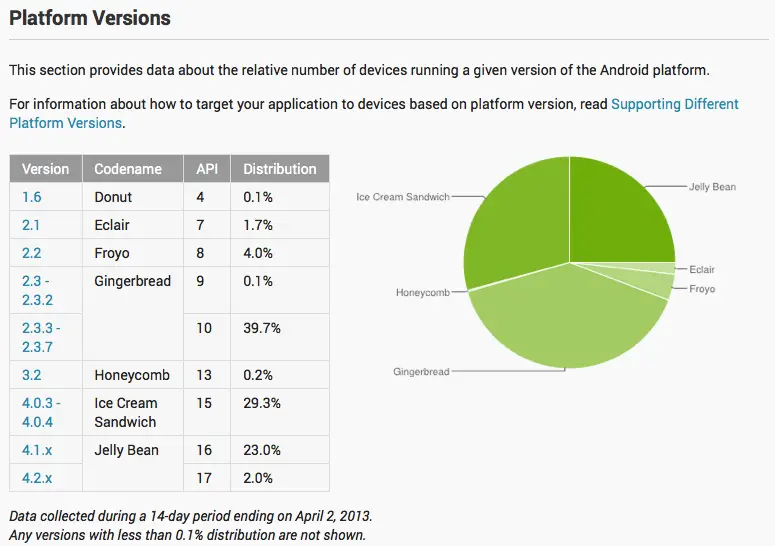
You know the Android platform distribution chart we take a look at the beginning of every month? Yeah, the one that tells us (and developers) the total percentage of Android firmwares running on Android devices around the world? We watched it like hawks, analyzing the data, rejoicing as Gingerbread finally began to decline as Ice Cream Sandwich raised. Well, you can forget about everything you used to know because tonight Google has announced that they’ve changed things up a bit.

Apparently, the old method of displaying their data wasn’t doing anybody a lick of good (and wasn’t exactly helping their PR either), so they’ve completely scrapped the old way of showing data from the famous pie chart. Now the chart will only show the percentage of firmwares running on active devices — those that have recently opened the Google Play Store — not just those that have pinged Google’s servers a year ago. Here’s what they said via the Android Developers site:
“Beginning in April, 2013, these charts are now built using data collected from each device when the user visits the Google Play Store. Previously, the data was collected when the device simply checked-in to Google servers. We believe the new data more accurately reflects those users who are most engaged in the Android and Google Play ecosystem.”
Honestly, this new method makes a lot of sense. In case you were unaware, this information was to serve one purpose and one purpose only: supply Android developers with the info they needed so that they wouldn’t waste their time, money, and effort on supporting a game or application for an Android firmware nobody was running. Now, developers are being shown only those users who are active on Google Play, the place where they’ll be listing their applications for download. Another tool for developers is a new chart displaying the percentage of Android devices equipped with a specific display resolution.

So, does this new way of displaying data happen to skew some of these numbers in Google’s favor? You betcha. Last month we saw Jelly Bean running on only 16.5% of total Android devices in the world. Of course, there were floods of headlines blasting Android’s “fragmentation” problem. Today, that Jelly Bean percentage has jumped all the way up to 25%. That’s nearing Ice Cream Sandwich territory, folks. I guess iFans are going to have a tougher time touting their software superiority now that the data has changed. What do you guys think? Does this new chart make more sense, or did you prefer Google’s old way of displaying data?


Agree this a probably what they should have done from beginning. But, it proves what I’ve discovered over the years to be true and that is, statistics can be presented to meet just about any desired outcome.
60% of the time it works every time. /end misquote.
Statistics are like a bikini. What they reveal is suggestive, but what they conceal is vital :)
The way I see it, over 50% are running Android 4.x, that’s how Apple ‘fought’ fragmentation, and most news reporters are too dumb to read past a version number.
I hope Key Lime Pie is also a 4.x version number.
This makes the data even more useful to me as a developer.
Yes! G1 running SuperD still making a dent.
If I understand this correctly, a device running a particular version of Android has to ‘touch’ the Google Play store at least once during a 14-day period to be considered ‘active’ and included in the dataset for the chart. That’s a lot more useful now for developers targeting the ‘current’ state of the Android OS target devices.
I suppose the older method was useful to show the comparative share each version holds across all (registered) Android OS devices sold to date. That would mean each new version would have to sell the sum of all previous versions to even reach 50% (or have some upgrade to the newest version).
The older method still used Play, but it counted devices that simply pinged the store for updates rather than only devices that opened the app itself. The old numbers showed which versions of Android were actively being used, while the new number show which versions of Android are going into the Play Store (and presumably buying apps).
Both numbers are useful in different ways, so personally I’d like to be able to get the old numbers somehow, too (though we’ll likely have to rely on the usual ad network stats for that).
Jumping jellybeans!
I guess I’ve been looking at it wrong all this time, I always thought that it was showing devices that were accessing the store. I’m positive that I read that description alongside the chart at some point.
It’s peanut butter jelly bean time!!!
the screen chart is really misleading… What specific size constitutes each screen size? does it include tablets in the xlarge? very confusing… hard to tell where you are
http://developer.android.com/guide/practices/screens_support.html#range
Its common sense when you think about it. iOS should be scared shitless right now.
Yay! Now I don’t feel so bad for only supporting 4.0.3 and above.
I am going to get so many dis-likes for this next comment;
How is this any different from someone saying “Im not 6ft, Im 182cm.” Obviously the 182 looks bigger. And don’t even get me started on the “ifan tougher to tout” statement when my NEXUS just got 4.2.2 a week ago.
Now my Motorola Droid running 2.3 that I just use as a music player does not get counted. That’s for the best.
The previous method was good for Google to show BIG numbers of activated devices, it was a good statistic for the start, to show how fast Android was rising! :)
Now that they achieved the 1st goal, they use a proper algorithm to make it FINALLY useful for the developers.