At the tail-end of January, Japanese carrier NTT Docomo announced their new lineup of Android devices (11 in all), one of which included the dual-screened foldable NEC Medias W. We’ve seen handset designs like this before with the failed launch of the Kyocera Echo and Sony Tablet P. That being said, we weren’t expecting too much from yet another dual-screen Android device, but after our hands-on with the NEC Medias W, we were singing a different tune.
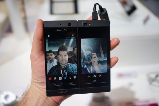
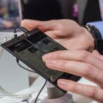
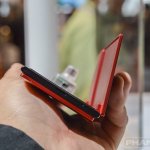
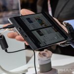
The Medias W utilizes two 4.3-inch qHD displays on the front and back of the device that open to create a wider, near tablet-like experience. Honestly, it’s perfect for users who’ve been eying larger Androids like the Galaxy Note, but don’t want to sacrifice the benefits of having a smaller phone. In execution the Medias W offers the benefit of extra screen real estate that trumps even the Galaxy Note, giving a better Android tablet experience than that of a big phone.
NEC’s tweaked their software — which is a mostly stock Android experience by the way — to display either extra content on both screens, or separate content (email conversations on one list, and an open email on the other) depending on preference. It’s all quite genius and executed better than we thought. Take a look at our hands-on video below for a demonstration and see for yourself if 2 screens are better than one.
While the Medias W is currently available in Japan, NEC announced the global variant of the device at MWC 2013 meaning it should work rather well with AT&T bands, sans LTE of course. With a dual-core Snapdragon S4 processor (MSM 8960), 1GB of RAM and a 2,100mAh battery, the Medias W may not have the horsepower to appease most Android spec-nuts, but this one trick pony may win over those looking for something different from the traditional Android experience (myself included).



Wow
lol aw dude if the ds emu gets optimezed for this boom ds! :P
Nintendo is going to have a hissy fit
It works similar to the note 2 but with a black bar in the middle. I think this could be great for people who want a larger screen but smaller phone, but first it needs to minimize the middle bezel.
agreed..this would sell big if they just can get the two halves to fit flush and seamless
impractical imo
somehow i feel for this dual screen concept to work, it’ll require a whole new OS from the ground up. Because time i see a dual screen, it reminds me of the failed launch of Microsoft Courier
It was a shame that Microsoft Courier got cancelled!
Nice, but not for me. The bezel between screens is too distracting. Better to go with phablet-sized devices until truly foldable/rollable displays come into their own.
Certainty not practical. The Notes II makes much more sense. They definitely need to go back to the drawing board on this one
I think I would prefer the screens fold together so that the phone would protect them when not in use. Just give me a notification light on the outside and I’d be set.
Or a small e-ink display like dumb phones, and have notifications scroll across.
There would have to be a huge bezel for that to happen, unless you can make a really really small hinge.
Nice find!
LOL…Basically, a refresh of the Kyocera Echo https://phandroid.com/2011/02/07/sprints-kyocera-echo-to-be-a-dual-screen-android-ultimate-multi-tasking/ and Sony S2 https://phandroid.com/2011/06/06/sonys-s2-dual-screen-honeycomb-tablet-hits-the-fcc/
…with better specs. Samsung is going to demolish the competition with their bendable screen concepts, once they’ve perfected that, which would allow a screen without any breaks between the viewing area.
It’ll be a long time before they can fold them, instead of rolling them, but could you imagine a 4.8″ phone fold out once to double the size to about 6.75″, and fold out again to reveal a full size tablet of 9.6″. A 4″ could fold out once for a 5.3″ and twice for a 8″ tablet.
Can’t wait until they do that! I’m sure the US providers wouldn’t be very thrilled because they wouldn’t be able to charge the ridiculous tablet plan fees that they do now. For my own needs, having a 5.5 inch screen that can fold out and have a seemless tablet viewing experience would be amazing!
Another Note 2 owner? I did the math on that as well and if a 5.5″ screen folded out once it would be about 7.25″, folded out twice would obviously be 11″. The only problem if they make these and they only fold once is that the aspect ratio would be bad. A 16:9 would fold out to 9:8 which is closer to 4:3 than 16:9, which would be ok for some tasks, but not videos.
Yup. Very good points. It’ll be interesting to see how Samsung makes it work. The promo video they had at CES made me realize that they could be a lot closer than they’re letting on to anyone. The folding screen could truly help create a “phablet” experience.
Carriers have an endless bag of tricks. Never think otherwise.
Not sure this will go anywhere, but it’s good to see people trying.
Name isn’t quite right though… V would be more like it. W would require two more panels. N would probably be a more interesting form factor.
Good call. An “N” format, with no bezel, would actually fold into itself and could protect all edges when folded (with growing edges on the outside two edges).
I had a hair line in the middle of my hp touchsmart computer very thin line and that bother the hell out of me! so what make this company think that people like to see a big line in the middle of their screens? this is just a waste of time and resources.
Id say the software is pretty good on this. Not a huge fan of two exposed screens though.
If it didn’t have that black bar in the middle then I would say that they have a winner on their hands
Seems pretty cool, need that bezel in the middle to be thinner though.
Am I the only one who likes these dual-screen phones/tablets?