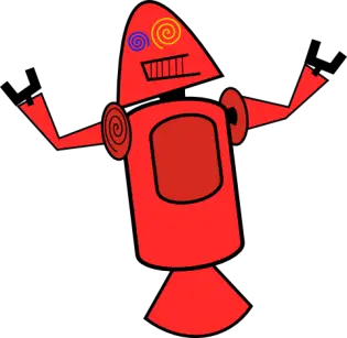
The little green robot we have all come to know as the official mascot of Android may never have been if a few folks at Google didn’t come to their senses. Pictured here is Googler Dan Morrill’s early representation for Android, designed to coincide with an in-house launch of the fledgling mobile OS back in 2007. “I had no eye candy for the slides we were putting together. Hence these guys,” Morrill relayed via his Google+ page.

Yikes. Could you imagine these colorful and zany robots (which look like demented bottles of ketchup and mustard) adorning the lawn of Building 44, appearing in TV commercials, and hiding out behind the screens of our smartphones? We doubt Morrill ever intended to see the characters through launch, however. At the time, most probably didn’t even realize the dominant platform Android would become in just a few short years.
Me, I’ll take Bugdroid munching away on Ice Cream Sandwiches and Jelly Beans over these so-called “Dandroids” any day. How about you?
[via MobileSyrup]


I need a bucket.
50 gal drum?
I am oh so grateful…
LOL….This thing looks like Rosey from the Jetsons!
Yeah, but on Meth
Slow news day?
Android mascot (Bugdroid) is beloved by Android fans everywhere. Some people like little news bits like this. Some.
No, best story of the year so far (only the 3rd Jan, but still).
luckily there is other news out there for you to “meeeh” at. All hail crappy empathy.
Looks like a bad version of Bender. lol!
ALL HAIL the GREAT BENDER!,no doubt a true representation of the everyday ANDROID enthusiast……….. :D
Kill all humans ?
Just the apple biters, how dare they cut into the fruit required for alcoholic fermentation……….;)
Bender should have been the Android Mascot Bite My Shiny Metal A**
looks like those crazy Olympics
mascots they come up with just plain bad
lol
Wait, no way this design came out of Google. It’s so hilariously ugly. It looks like they told a kid to draw a robot in MS Paint.
says the MALE with an ugly azn FEMALE anime avatar…
Actually, my avatar is artwork of the mage character Vivi, from Final Fantasy, by the artist Yoshitaka Amano.
Also, who the hell cares if I actually was using a female avatar, as a male? Get your dumbass outta here with that lame retort.
Dude, your avatar is awesome. Just sayin’
(I’m a fan of Final Fantasy too)
Thank every thing that is good for Andru
Thank God for small things… That would have been horrid…
I don’t mind them. And honestly, if this had become the Android mascot, you would be saying the same thing about Andy. “Eww, glad we didn’t get the green trashcan with arms and legs, RocketBot is awesome!”
And there’s no reason they couldn’t redesign him (it ?) to be more friendly looking.
They look like scary marital aids…
Dear god. O_O
Not sure why people are sensationalizing this. As a designer, I can assure you that will never get passed the whole approval process. And it didn’t. It’s more like a rough mock up.
I think it looks better than that bland green thing
Wait- wut? O_o
No, I’m serious, Android should be represented by a transformers style robot. The current mascot looks childish. Android is a mighty power, but the mascot makes it look like it’s Tizen.
But w/ glitter right..lol. Just messin’ w/ ya bro. *backs up slowly*
lol leave him be I think he got pounded enough
Dude I’m sorry but you are crazy.
NO muscles, NO glitter. Holding a glass of good Scotch. That is my Android.
That would only appeal to tech people and nerds.
The current Android mascot has a much wider appeal.
Your mascot would only encourage the Android is too hard to use mentality.
Remember most of the population is a little childish.
who says the current one has much wider appeal? How many people in the world have you asked about the Android mascot. Seriously, how many smartphone users in the world… no wait.. how many Android users in the world actually know there is a mascot. Fail comment.
I’ve seen the mascot in commercials and the like, does everyone recognize it as the mascot, maybe not. But, I know I have one little green android on my media center, and more than a few people have said to me, really you like Android that much.
But this horrible (I like bender on crack) picture or some transformer like figure, they’d remember it in a negative way.
The current Android can look mean but its not intended to look all mighty and powerful. They need a friendly welcoming mascot of which is what they have now and it works.
It looks obese to me.
Obese? you are calling a robot obese?
Yes. This is what will happen to bugdroid when he stops innovating :D
(see attached photo)
Android should have a bitten off apple for a mascot
Looks like red and yellow dildos with suction cups on the bottom… LMAO!!
^^^ Sorry couldn’t help it.. I had to. LMAO!!!
They look dizzy.
They look dizzy
Still looks better than CM’s SID or whatever it’s called.
I love you, man. I’m glad other people despise Cid…
I like it better.
DilDroids…
I’m glad these aren’t Android’s mascot. Their cartoon like design makes them look toy like and does not demonstrate the power and magnitude of Android.
Drunk robots?
These are not the Androids you’re looking for.
Good ghod.
It’s like Jar Jar Binks!
Those are hideous robots! Gotta love the green machine we presently see now!
Yuk
Haha Andru beats this any day. Now its time for Tizen to changes their weird genie logo if they want to get customers.
Oh my