


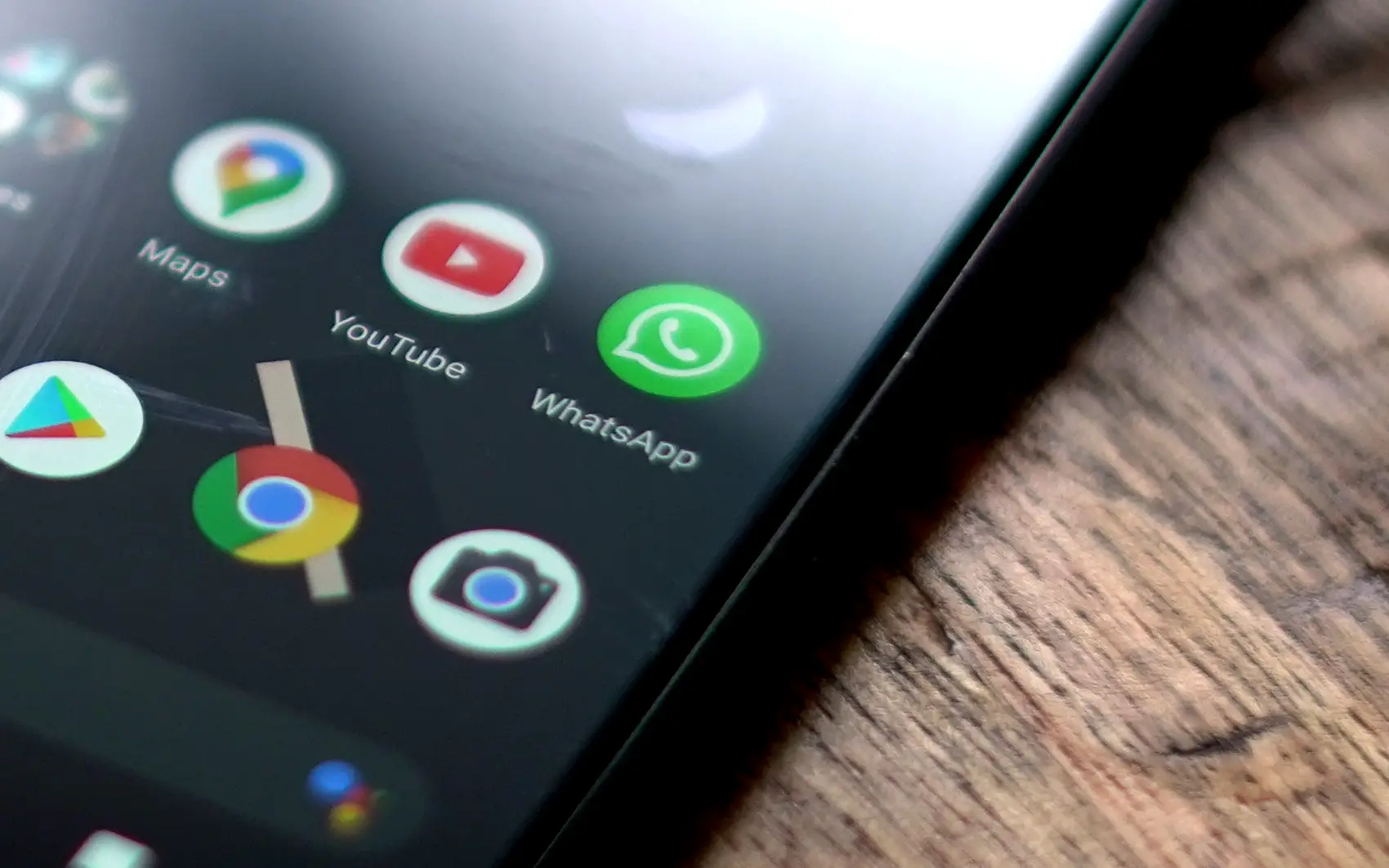
Are you ready for the best looking Google+ experience to grace an Android device? Good, because the official app was just updated in the Google Play Store and it looks great. The stream view has been revamped as well the navigation ribbon, leaving us with an interface that is sort-of reminiscent of recent updates to Facebook’s official app while adding in enough Ice Cream Sandwich flair to make the experience feel natural to the OS.
I’m still waiting for Google to integrate the social network more directly into Android (Circles for organizing contacts, anyone?), but given how the search giant has been tying G+ to all of its services lately I won’t be surprised to hear developments on this front out of Google I/O for a potential release in the next iteration of the OS, Jelly Bean.
Here’s the full changelog:
- Visual refresh of the stream and improved navigation
- Initiate a Hangout from the main menu
- Support for ringing hangout notification
- Support for post editing
- Messenger suggestions for people you may know
- Download photos from posts or Messenger conversations
Initiating a hangout should be easier than ever with access directly from the apps main menu. Grab the new version of Google Plus from the Google Play Store now.
Google Play Link: Google+
[Thanks, Mr. Eastwood!]


Oh look. It’s STILL not tablet-optimized. I don’t know how Google expects other companies to make tablet-friendly apps when they don’t take the time to do it for some of their flagship products.
Also, first impressions are that it’s harder to read with the image backgrounds and performance suffers.
Its silky smooth on my Gnex.
I haven’t had a problem with it being hard to read – yet.
It looks great
“Messenger suggestions for people you may know”
Oh boy! I hope this is as helpful as suggestions from Amazon as to what to buy and Netflix as to what to watch! Those are always right on the money! :P (Chances are, I already talk to the people I want to talk to and that the suggestions will be yet another section of G+ that most people end up ignoring.)
I checked it. It just has your friends that you haven’t opened a conversation with. It isn’t that bad, but I don’t use messenger often so I am not sure how often I’ll need that.
Yeah, I don’t use it ever either. I’ll usually just shoot a straight text.
Very slick. Love it.
Does it bother anyone else that iOS users got this update before us android users..
We did get more features than they did. I guess it doesn’t fully help but I guess it makes sense.
What a great piece of information on the advantages of latest
updated Google+! Very timely too as we watch how Facebook responds to the
competition.
Ok, technical improvements are great, but it could have come without the horrible visual overhaul.
In my opinion, there are many reasons why the update is not that good…
~ Inconsistency:
-In your profile, switch between bio, posts and photos, and notice how they all look different. Albums previews have their label at the bottom, posts previews have theirs at the top, while bio has a grey background color that appears nowhere else in the app… (maybe in the comments section?)
-In posts previews with a backgroung image, text have a different font size than in the others.
-With the new menu, navigating in the app is moving away from ICS standard.
-The widget still has the old look, if the new one brings “polish and performance” as they say, why didn’t they apply it there too?
~ Polish:
-The new stream is so ugly in landscape mode… and I wonder how worse it is on tablets.
-About posts previews, to me the fact that the profile picture exceeds upward makes the label looking like it’s linked to the post above, not below (except for the top one, of course).
-As it’s already been said by many people, depending on the underneath image, reading the text is sometimes arduous.
~ Performance:
-Really Mr. Gundotra?! Man, on my Galaxy Nexus the new stream laaags.