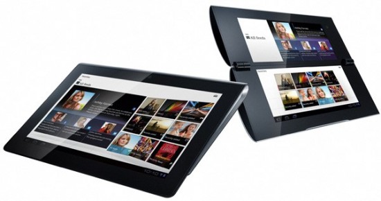
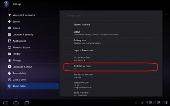
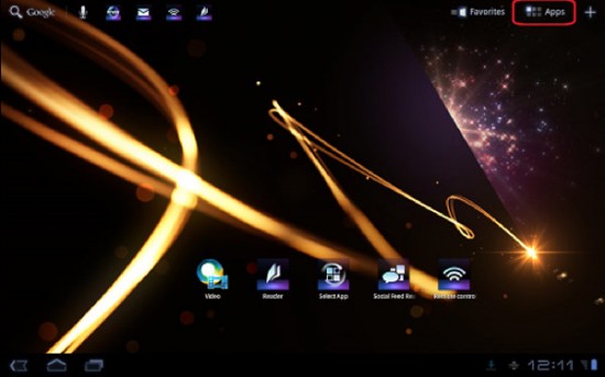
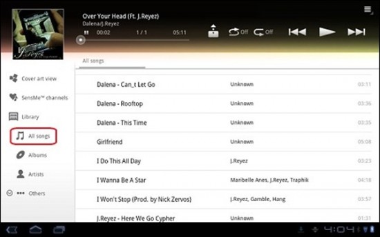
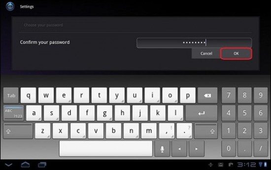
Thanks to a Sony support page that went up on their site and was immediately taken down, we now have a better idea of what to expect as far as software goes, from Sony’s S1 and S2 tablets. Looks like the Sony tabs will be shipping with Android 3.2 Honeycomb and will Sony’s own custom UI skin over the stock Honeycomb experience as shown off in these leaked pics.
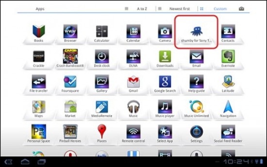
As shown above is a new keyboard app, Chumby app, and Sony’s own music player app complete with “SenseMe” feature. Still unsure if I love or hate this new UI but what do you guys think? Did Sony’s new UI take away from the true “Honeycomb experience?” Have these screenshots changed your opinion at all of Sony’s upcoming S1/S2 tablets?
[Via CarryPad]






I think it looks really ugly.
considering how I truly hated the stock keyboard on my Transfomer I think that the keyboard will go nowhere. As far as the rest of the UI goes, I like seeing the quick settings on the top of the home screen. The music player makes no difference because even if a user doesn’t like it they can just download Google Music. Now that white app tray on the other hand, is a complete turn off. They are taking away the sexiness of honeycomb’s dark blue aura and replacing it with white, which looks completely out of place.
Kewl. Where do I put my UMD, MiniDisc, Memory Stick Pro Duo, and Blu-ray in this Sony beast of a machine?
Sony makes the best Hardware. So glad ericsson isnt making this
As long as skins don’t slow down updates they are ok.
nope. and its not going to sell good.