This is a guest post by Guenther Beyer, an Android UI and Design expert who recently launched AndroidIcons.com to help developers improve the look and feel of their apps.
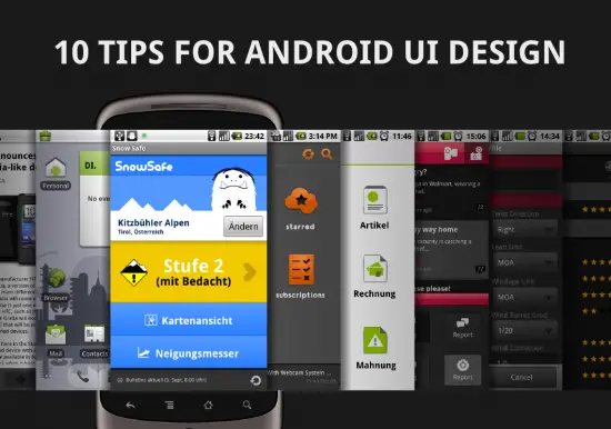
These days many developers are jumping on the mobile train for fame and fortune – and they are right in doing so – there isn’t a market growing as quickly. Great, unique ideas are emerging from small teams. Apps are built at work on lunch breaks.
Sooner or later every development cycle gets to the point where the app is almost done. Now what? Heard of the two magic words “User Experience”? Well, you better, because the mobile world has its own set of patterns and rules of which you might not be aware. Here are 10 tips to improve your new mobile application prior to launch, maximizing your potential and minimizing your frustration due to bad reviews and low download counts.
1. First launch experience
Good websites and mobile apps have quite some similarities. Both need to connect to the user or visitor instantly. If they fail, the next best alternative is just a couple of clicks away. Most users will not waste their time trying to figure out how to use your app or read a complicated manual. They will simply move on.
At first launch, everybody will have the same three questions on their mind:
- Where am I?
- What can I do here?
- What can I do further?
Try to answer these questions instantly. If you can convince your user that this is the right app for them in the first couple of seconds, they will surely dive deeper.
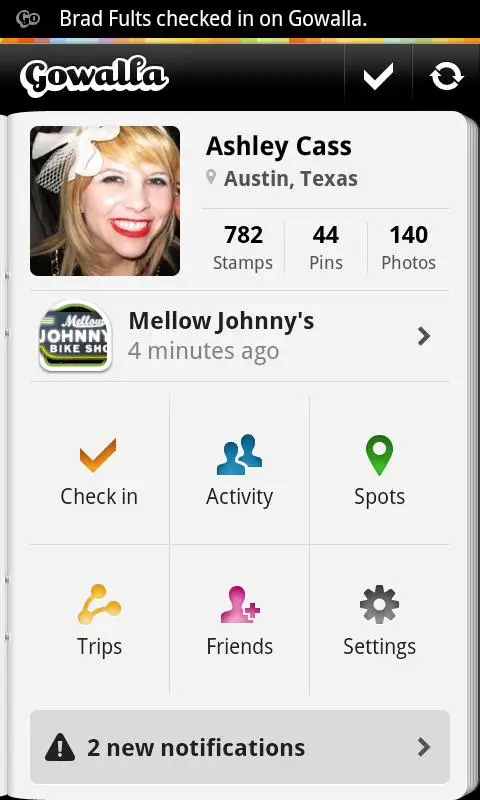
Gowalla has a beautiful first start experience. A passport opens slowly, giving you instant access to your personal information, instant suggestions and further actions and notifications.
2. Every input is valuable
Think for a moment about how you really use your mobile device: a developer’s phone is safely sitting in its dock on a plain table, connected to a PC with a large keyboard, probably with full backlight turned on. Now think about how everybody else is using their smartphone: walking over a crowded street with a cup of coffee in one hand and his shaking device in the other, trying to figure out how their favorite team played, between the last meeting and the next one.
Most of the time people just have one (big) thumb to navigate through your app. Forget about multitouch and similar complex input methods – scroll, flip and touch are your friends. Let people navigate from screen to screen and information to information quickly, without the need to stretch their arms first. And let them get there quick. Every input counts.
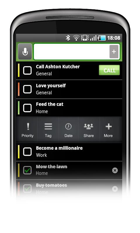
You can add a new task to Taskos with just one simple touch (and some typing, obviously). Right after that many settings can be configured, but these are all optional.
3. Contrast
While your development environment might be a big, beautiful screen in a nicely shaded room, the place where your users use your app might not be. We need to use our mobile devices more frequently in bright sunlight than we would like to. This has a big influence on how we view the screen and how the interface should be designed. Details get lost, colors can’t be distinguished from one another. Some elements completely vanish due to the reflections.
This does not mean that you have to design only in black and white and throw out every beautiful detail of your UI design. It just means that important elements should have enough contrast to be recognized as such under more stressed conditions. If you want to color code elements, add a fallback option like simple text labels. And if you want to improve your app’s appearance with small details and bits of information, that’s fine. Just make sure that your UI even works without those.
Give your interface a clear hierarchy by displaying the most valuable features largely and brightly. Remove anything unimportant completely from your app.
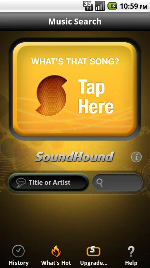
While there are many options presented on the SoundHound screen, the main function is clearly displayed bright and bold at the top of the interface.
4. Don’t let them wait
Nobody wants to wait, especially in a mobile world. We carry our devices on the train, answer a quick mail on the bus, or check the weather while walking out of the house. We do all these small things on the go, to gain a little bit of more free time for the things we really like to do. Don’t let people wait for your app to do a certain thing. Improve the performance of your app and tweak the UI to get to relevant results faster.
Certainly everybody will understand that there are tasks that require some heavy performance from your app or some large packages of data that need to be pulled from the web. But never let your users wait for anything to happen. Let them feel that something is working in the background. Add “selected” and “pressed” states to your buttons, add spinners for short loading times and progress bars to longer ones. But never, never, never confront a user with a black screen.
Waiting is always annoying. At least let your users know how long they will have to wait.
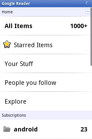
The Google Reader app shows a small spinner in the top, every time some loading happens in the background, so you are always aware that you might have to wait a second or two.
5. Don’t forget the landscape
Sometimes you just forget that your mobile Android device has more than one basic phone orientation. While most people are comfortable with their apps working only in portrait mode, some really prefer to use their device in landscape mode, especially the ones with physical keyboards. This group of user will probably grow with the widespread adoption of Android tablets.
Don’t make the mistake of thinking of the landscape orientation as a wider view of your lists. Using the device in landscape mode is a totally different userexperience. Now you have two thumbs to interact with the screen. Typing is much easier and you mostly tend to read from left to right, not top to bottom. In fact, if your app is heavy on reading and writing you absolutely need to support a good landscape mode.
Landscape orientation can also feature a totally different experience to the users. You can use the wider layout to display information in a completely alternative way. For example buttons could be moved to a side that were previously sitting at the top of the screen. Maps, charts and graphs can display new pieces of information when shown on a wider scale.

Start to build and improve one screen orientation. Then create the second one. Be aware of the pros and cons of each layout and use them wisely.
The official YouToube app uses two different layouts for the two orientations, that both work perfectly at their respective ratios.
6. App Ecosystem
While you can design the most unique and special app that might serve a lot of different purposes, it will always be just one step in a chain of actions.
Think about what your smartphone can do out of the box: phone calls, contacts, texting, mails, browser, taking photos and videos, GPS and maps – the list goes on. Use this as an advantage. You don’t have to create all these building blocks on your own. Users are familiar with the standard toolset- don’t try to reinvent the wheel. At the same time this will also spare you a lot of coding work.
Here’s a very short but very common chain of action: Get a call that invites you to a certain location. Check the time. Check the weather. Head out, searching the place with Google Maps. Check in with Foursquare. So where does your app tie in the workflow here?
No user will ever use his mobile device just for your application alone. But if you manage to create a great piece of software, they will incorporate it into their mobile workflow on a daily basis. Give them easy access to further features like sharing or looking up interesting information on the web, and let them jump fluidly between your app and others.
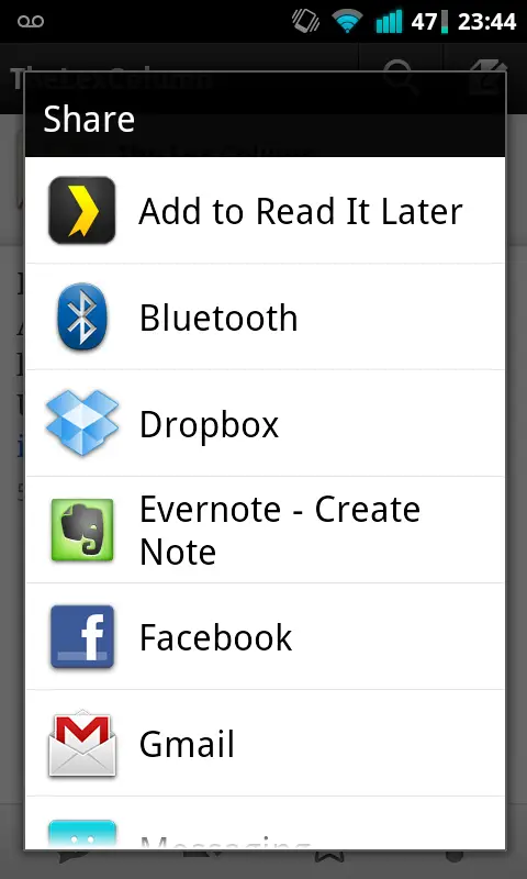
Many apps can hook directly into the Android’s sharing mechanism. Use this to your advantage.
7. Make your app unique
There are more than 200,000 apps on the Android Market. You might ask yourself how to stand out between all the quite similar offerings. If you set out to build the next boring Sudoku game in black and white or the next note-taking-app based on the official code example, you will have a hard time getting some decent download numbers.
Don’t assume that there’s no room for another great app that is already covered in one way or another. People always prefer different things. There is no Jack of all trades. Some prefer a note-taking-app that can do almost everything. Some need just a simple text editor with syncing capabilities. And there are others that just want a clean UI.
Either way you go, build an app with character. All basic features are already covered by the OS and the core apps. Stand out by creating something that users will prefer to use over the built-in solutions. Think of your app as a small robot living inside your smartphone. It communicates with you, tells you interesting things and helps you with your daily tasks. Do you want your robot to be smart and professional, or cute and lovely, maybe even cheeky and funny?
Keep that in mind when building a great app from the ground up. People with character enjoy apps that fit their personality. Want to build a photosharing app? Add a paparazzi like theme to it, with badges to earn. Another location service? Strip it down to the most basic features and automate everything. Take a problem with an already well known solution. Now think about, how a slight change of perspective could change the whole application and how users work with it.
And don’t let me get started with good UI design …
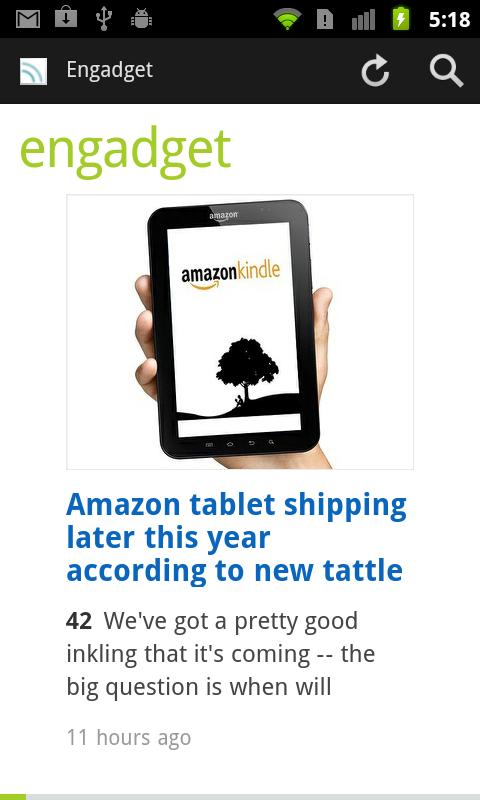
Feedly is just another news reader with Google Reader integration, but it uses a magazine like presentation and very clean design to distinguish itself from other readers.
8. Stick to the guidelines (as long as possible)
While you want to create an unique app, that stands out, you don’t want every piece of your app to be totally special. Google suggests a lot of guidelines for Android app design and development. Get familiar with the guidelines. People have a much harder time to dive into the complexity of a modern smartphone than you think. Don’t make it even harder for them by implementing custom interaction elements all over.
Learning to work with an Android device need a user to get comfortable with touching, typing, swiping, shaking and even pressing hardware buttons from time to time. They need to recognise patterns like input fields, select boxes, modal dialogs and long presses for contextual menus. Do you really want to throw more at them?
Go with simple, straight forward lists. Start your app with a dashboard consisting of big icons for the main functions. Add a header that provides access to the most common feature and let users go back to the start when they get lost. If you can’t improve these metaphors dramatically, don’t change them. People will value consistency within your app and the whole operating system.
Study Google’s interfaces and decisions carefully. Get familiar with the whole experience, and try to create your app with Android’s guidelines in mind. But don’t take this literally – If you can improve certain elements, and you are absolutely sure about that – then for God’s sake, do it!
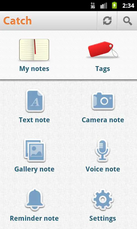
Frequent actions in the title bar, big simple, icons on the body. Catch Notes works great by sticking to the basics.
9. Guerrilla testing
Let’s face it – all users are different. You can try as hard as you want to, you’ll never satisfy everybody. Even trying to get your app right for the majority of people is very hard.
Don’t get me wrong here. This is no excuse to ship your app without considering the different approaches of how people will use the app. You need different people to test-run your app and iron out at least the most annoying problems and bugs. Big companies spend thousands of dollars on usability experts, that test hundreds of different users in very expensive labs to get their software right.
While this is a great way to improve any app’s UI, it is hardly affordable for most independent and small developers. Don’t let this be an excuse, either. You can do some very cheap and swift guerrilla testing, to massively improve your app and make it more accessible to a larger userbase.
Grab your developer device with the app’s prototype, spend some money on small gifts like buttons or stickers, and head out. Start with colleagues and friends, and progress to strangers you never saw before. Most people will gladly spend a little time with something brand new, as long as you are polite and even provide a small reward for their time.
Let them use your app like you intended to, and watch carefully. Tell them what their goal is, but provide as little help as possible. But don’t let them get stuck either. You’ll figure out your apps pitfalls and bottlenecks in no time.
10. Publishing to the Market
Well, you did it. You’ve built your first app. Congratulations. It feels great, doesn’t it?
Now don’t make the mistakes many do. Sure, you want to get the app out to the masses and hear what they are saying about it. But taking a couple of last steps will give you a much better first launch.
You’re sure you did some proper testing? Different devices, hdpi, mdpi and ldpi? Alright. Let’s take care of the small things.
Google wants you to upload your app to the Market with 4 additional assets:
- A description of your application’s features
- The app’s icon in high resolution
- A small promotional banner that will be displayed on the Android Market
- And another larger “features” graphic that will go alongside your app on the web-version of the market.
Don’t make the mistake and underestimate one of these additional assets. A well written introduction to your great app coupled with some clean and well designed graphics can make the difference to all your other 500 contenders on the Market. Users will notice the extra mile you took, transcending over to the level of detail and care you put into your application.
If creating some nice and clean graphics or writing some lines of good copy isn’t really your cup of tea, ask a designer and/or writer. The extra money should be well worth your apps success, and it should take only a couple of hours.
If you even want to take your promotion a little further prior to launch, get a fitting Twitter account, create a beautiful landing page and start the buzz. You can’t start marketing too early. Let people get excited. They will spread the word for you long before your app is finally available.

The Android Market online uses the high-resolution version of your app’s icon and the large feature graphic.
About the author
Guenther Beyer is an interface and icon designer with Android-focused experience since 2008. His consulting company – Opoloo – helps Developers maximize their apps’ potential with fresh and polished UI design. They’ve recently launched AndroidIcons.com which allow all developers to instantly improve their apps and games with slick icons for use throughout their interface.”





This guy is one of the best android designers I have come across. I just launched a new social “gamified” photo sharing application for android called kapturem and android icons designed the whole UI. I am really pleased with their work. Great article, great designers. If you look at the first image in the article thats kapturem.. If you have an idea for the next great android app def reach out to android icons for the design. In the mean time check out kapturem.
Great article, I really enjoyed it. One of the better “tips” articles I have read keep up the great work. Also, awesome I/O coverage:)
Hey, if you guys know any good sites for beginner android programming, i’d appreciate some links! Thanks
http://developer.android.com/index.html
Hey thanks a lot guys.
@smc29:disqus appsbar.com
A lot of help on I am Android. This is the Question I posted and the replies. VERY good information.
http://iamandroid.com/forum/topics/help-please-father-son
kapturem UI featured in the main graphic for this article! http://goo.gl/pLcsY
What app is the number 2?
The app is called Taskos. It’s a simple todo list with Google Tasks sync https://market.android.com/details?id=com.taskos&feature=search_result
My problem with the “SoundHound” example in #3 is that if the button is too large, I don’t see it as a button to be pressed… I see it as a background image, a display graphic, or whatever. But I don’t see it as a UI widget to be pressed.