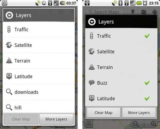
What happens when you dig down into the Google Maps APK and switch its API level over from 8 (Froyo) to 9 (Gingerbread)? You get what Maps will eventually look like when it is running an Android 2.3 handset. Notice the transparent header of the current Maps dialog (left) gives way to a solid black header in Gingerbread (right). This lines up with the change to the notification bar from grey to black we initially told you about in our first Gingerbread report.
Also note that the rounded buttons of old give way to a more squared-off look at API level 9. Now there isn’t much more we can infer about Gingerbread’s overall look and feel from this one view, but it lines up with the 2.3 release only providing slight refinements rather than a sweeping overhaul. I like the new look the more polished feel it could potentially give the OS, which is a move in the right direction if any.
[Android Police via Engadget]




Yeah, this looks great. Will this come to the g2?
hmmmm kinda looks backwards in some regards. the left image looks more transitional with the program running where the right (gingerbreak) looks more like a menu from another program
All this Gingerbread and “Nexus Two” has made me forget all about the Mytouch 4G. Its going to be a good Christmas this year.
I think the notification icons are probably the weakest in terms of polish. Everyone I talk to and see comment about them online thinks they are just too cartoonish to be taken seriously. It’s the big think borders and rounded edges on something that is only 16×16 basically.
@jdog
How do you know there is going to be a nexus two?
I think it looks better in the new style on the right. I’ve had it with rounded edges on everything. Ugh.
-B
Hmm, I like the Froyo view better than the (potential) Gingerbread one. I don’t think sharp edges make it look more clean. Plus, the removal of the semi-opaque header background seems like a move in the wrong direction to me. Anyway, I’ll wait and see what actually happens.
I think the old version looks better without those green checkmarks ^^
I agree with Brad 2, I am tired of rounded everything. Sharp gives the UI a more distinctive look. More BOLD. Rounded reminds me to much of iOS.
Is there going to be a nexus two?
WILL THERE B A FRONT FACING CAMEA WITH GINGERBRED?
@SA are you actually wondering or are you trying to get someone to say there will be a Nexus Two so you can then slam them with you’re amazing knowledge?
@mediumnog
What makes you randomly accuse me? I wanted to actually know before I go ahead and buy a phone
@SA oh, ok, my bad. I don’t think anyone knows for sure if there will be an N2, but google has to do development on one of the next gen phones, whichever one they choose may as well be the n2, branded or not. Although you may have to get it through the developer program for it to be unlocked
@mediumnog
Ok, thanks. So I had a dilemma between the nexus 1 and the g2. So is it best to just wait? Is the nexus one really outdated?
Oh and I am a developer too
Well how about, let the user decide what them they want. That is more in line with open source and linux ideals anyway. This is like the beginning days of linux when we would have to edit config files to change the theme.
While the new buttons are better when specifically looking at them, I think they blend too much with the menu/background and might be hard to find in actual use.
@The Reverend Earl: Yes, once we get gingerbread, a front facing camera will appear on all of our currently non-ffc enabled phones!
@SA I wouldn’t say it’s outdated at all. I own one, and spec and performance wise it’s great, although I’m not a big fan of the design. If you want to have the latest and greatest android releases, then n1 is the way to go.
I’d wait at least a couple of weeks and make sure gingerbread will be release on the n1 (probably will) and to see if google chooses a new dev phone or n2. just my 2 cents though
I think it looks fine but can somebody pull up a screenshot of Android 1.5 or so to see what a menu looked like. In some aspects this kinda looks like they took back out the gradients and what not that some said made the UI look “warmer” instead of the cold greys. Now it seems like its solid greys again. Maybe they thing MS has something with their “flat” UI design.
@ Alexander
I was told some phones had it with 2.1 (eclair) but i didn’t get it on mine (HTC Hero) with the OTA update :(
it’s good to know we’ll all get it with Gingerbread! (IF they release it for the Hero of course!)
it looks great, it also looks like how it does on Google TV. which is kind of the way i expected gingerbread to look.
I think that having opaque windows puts less processing power to use and that should probably be a move to improve the graphics performance and fluidity in general.
When you have a transparent window drawn on top of an existing window, you not only have to draw the new window, but take into account the window(s) behind it and draw them on the new window as well…
Humm, im not noticing much difference. Certainly nothing to get excited about.
Prefer Froyo based on that sample.
yeah…that seems to look more like android 1.0. backwards step
This saves batteries farther more. Great stuff, bring it.
The menues like this are 1 of the things that bug me most as they don’t go with the UI of many apps but the new style looks like it will better (and looks better in general). It’s a lot clearer and uses less processing power to do opaque headers, square corners and solid background buttons so should be a bit snappier.
Does this remind anybody else of Windows Phone 7?
Wow, useful features.
how is this a “revamped” UI? looks the same or you might even say it looks worse or that google actually took a few steps back when designing it. and if you look real close and pay real good attention to details you’ll see the picture on the right (supposedly gingerbread) looks like some photoshopped picture or something seriously incomplete. just my opinion…